To begin the process of adapting my design, I conducted some research on the FC25 Web Companion App as I had already researched the mobile version. This helped me to see the necessary differences between the two versions such as the position of the menu buttons.
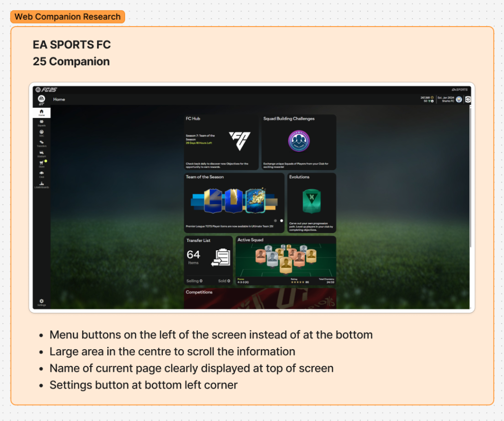
Following this research, I concluded that I would relocate the main page transition buttons to the left side of the screen for the web version.
I also looked at websites that have a tablet and mobile version to inspire me and help me with the scaling of my own conversion from mobile to tablet and desktop.
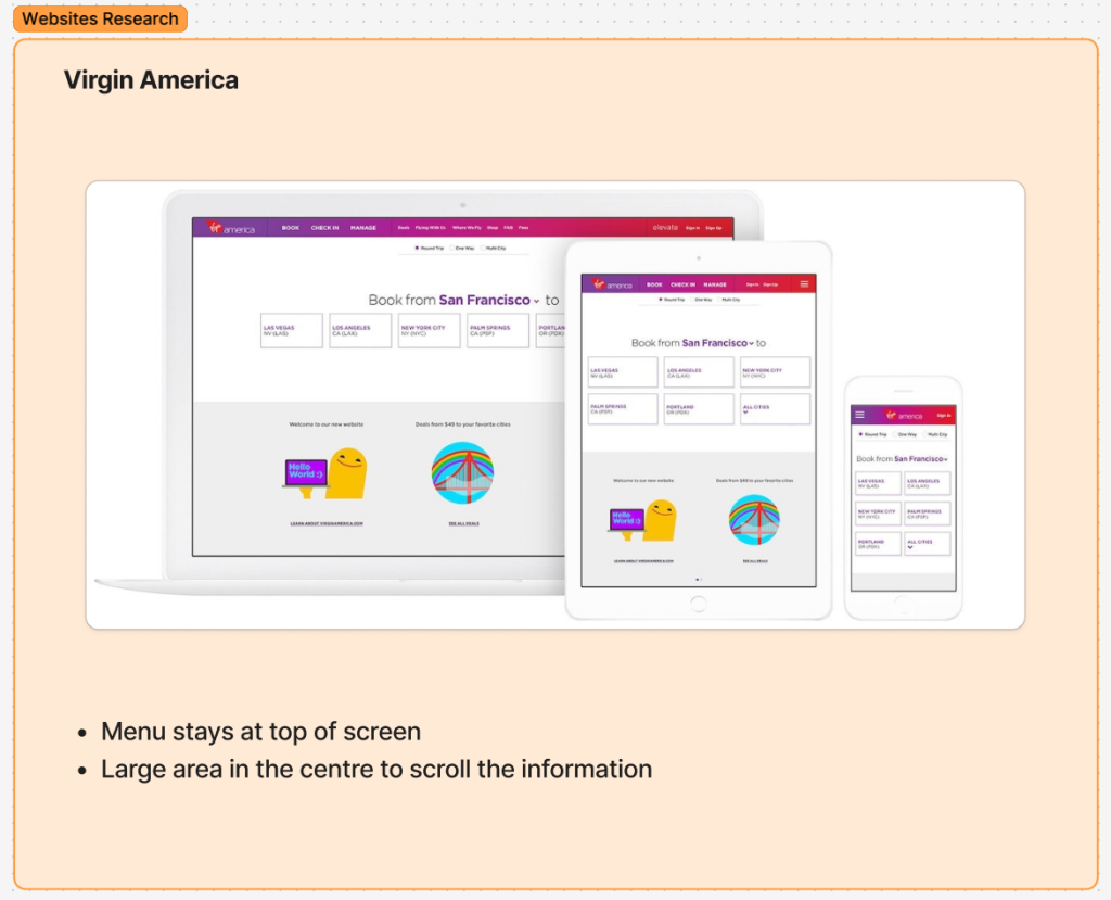
For example, the Virgin America design gave me inspiration with the differences between the versions clear to see.
In order to create the scaled up tablet version, I utilised the auto layouts that I had previously created when designing the mobile version to easily scale up to the correct size.
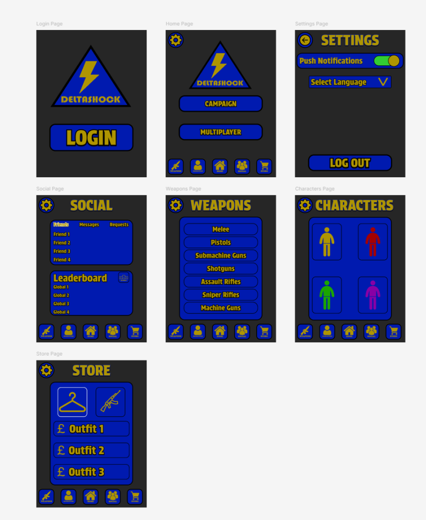
I also decided to relocate the position of the titles because there is no longer a camera in the way which was an issue for the mobile layout.
I then followed the same process of using the auto layouts to help me scale to the desktop size.
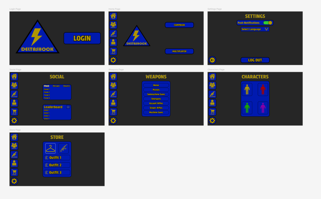
This shows the layouts of the main pages following the rescale to the desktop app. I decided that the information in the middle of the screen works well for my app and is aesthetically pleasing.
I encountered an issue during the process of converting the components across to the two versions and I had to remake some of the components so next time I design a companion app, I would improve by making it easier for myself from the beginning.