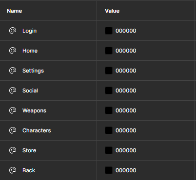
To begin with, I decided that buttons the user is hovering over should highlight in order to make it clear that there is intractability. I was able to achieve this by creating colour variables and changing the colour of the outline whenever necessary.
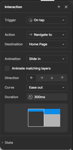
To move between the main pages, I used the navigate to action with a slide transition to make it aesthetically pleasing.
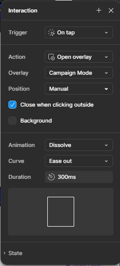
On the home page, I used overlays to display the information about the different games.
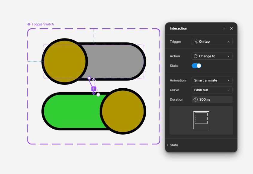
On the settings page, I created a toggle switch for the notifications, utilising component variations.
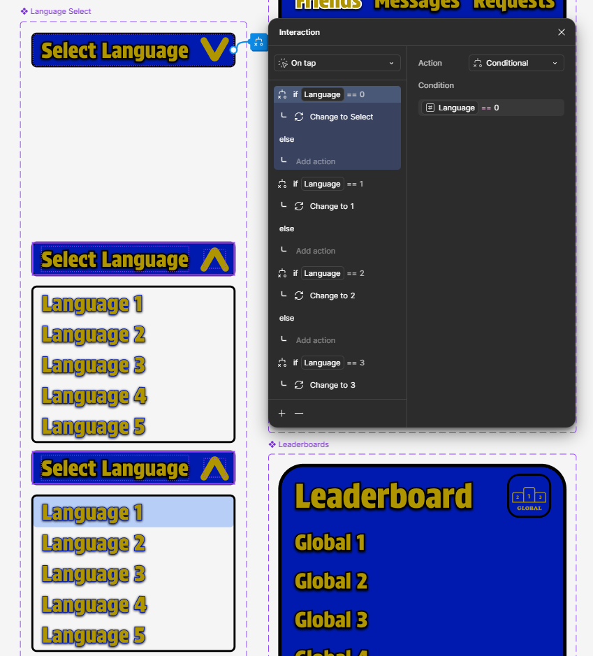
I also created a dropdown menu for the language select, utilising boolean logic to ensure that the correct language is selected.
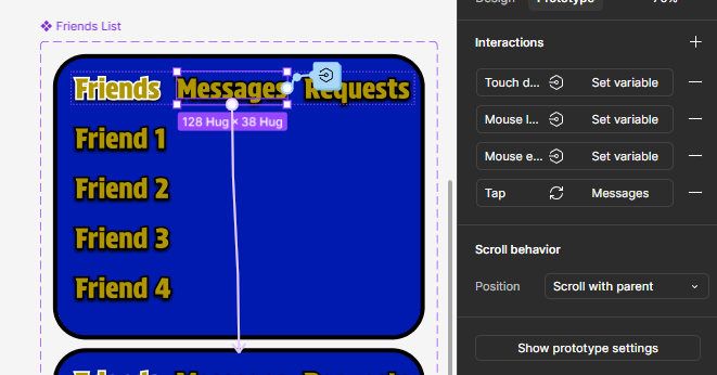
For the friends list and leaderboards on the social page, I used vertical scrolling alongside component variations to keep the component compact.
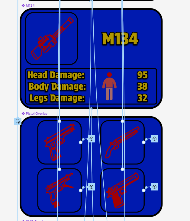
For the weapons page, I created different overlays that appear to show the choice between the different types of weapons and the stats of each one.
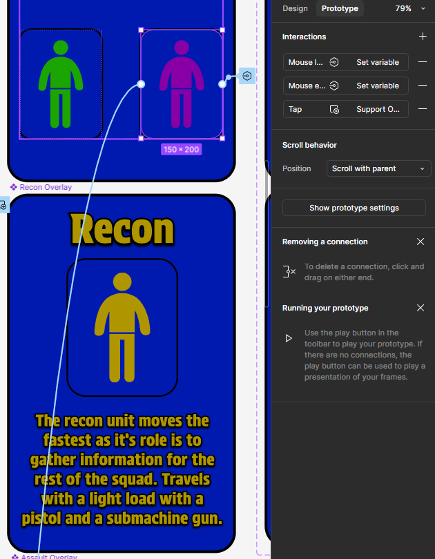
For the characters page, I created different overlays that appear to show the descriptions and names of each class.
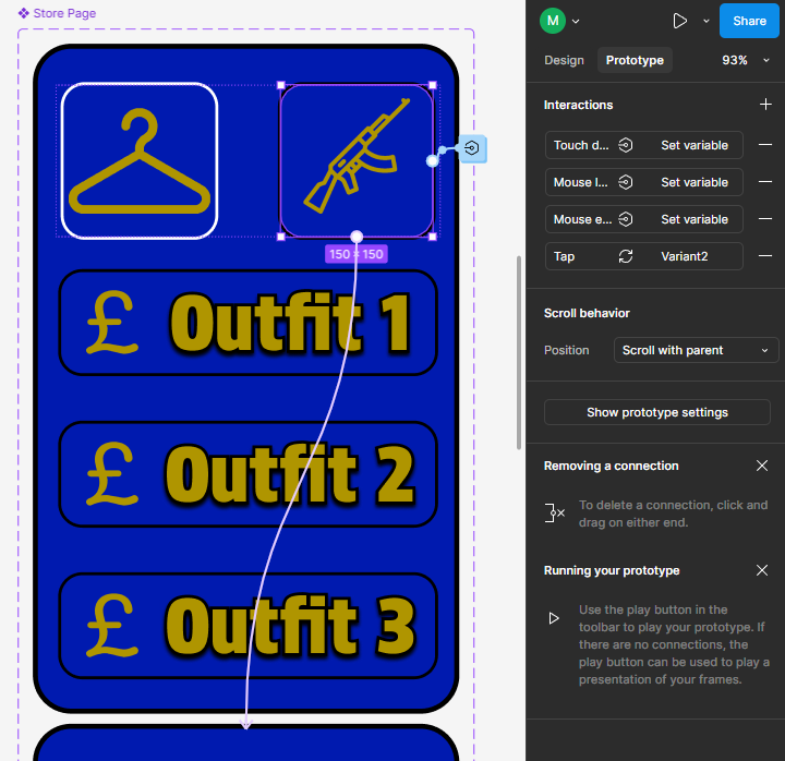
For the store page, I created a scroll area with a toggle between the two types of items available for purchase.
I found that creating overlays and multiple variants of components was very useful for optimum functionality. I also ensured that I used auto layouts to make it easier to scale the different components in case larger or smaller sizes of them are required.
I created icons for each of the interactable buttons using Adobe Photoshop and used the built in variable feature and boolean logic to ensure that the app looks aesthetically pleasing.